Valley Glen Project Design
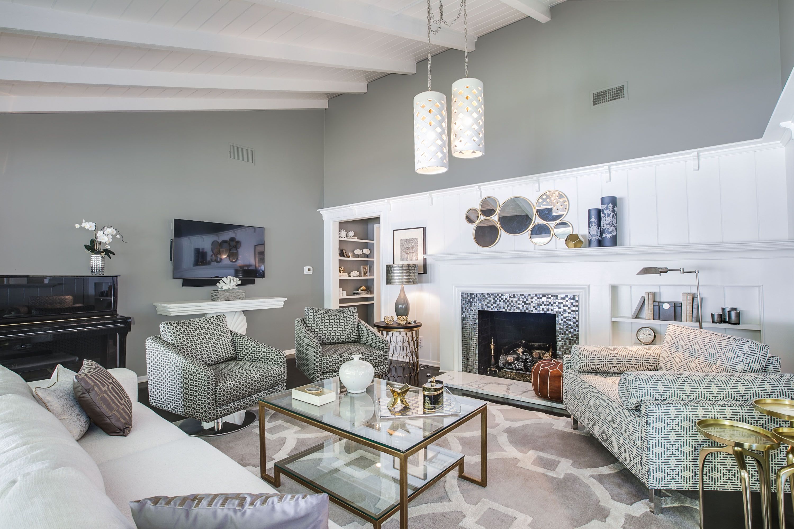
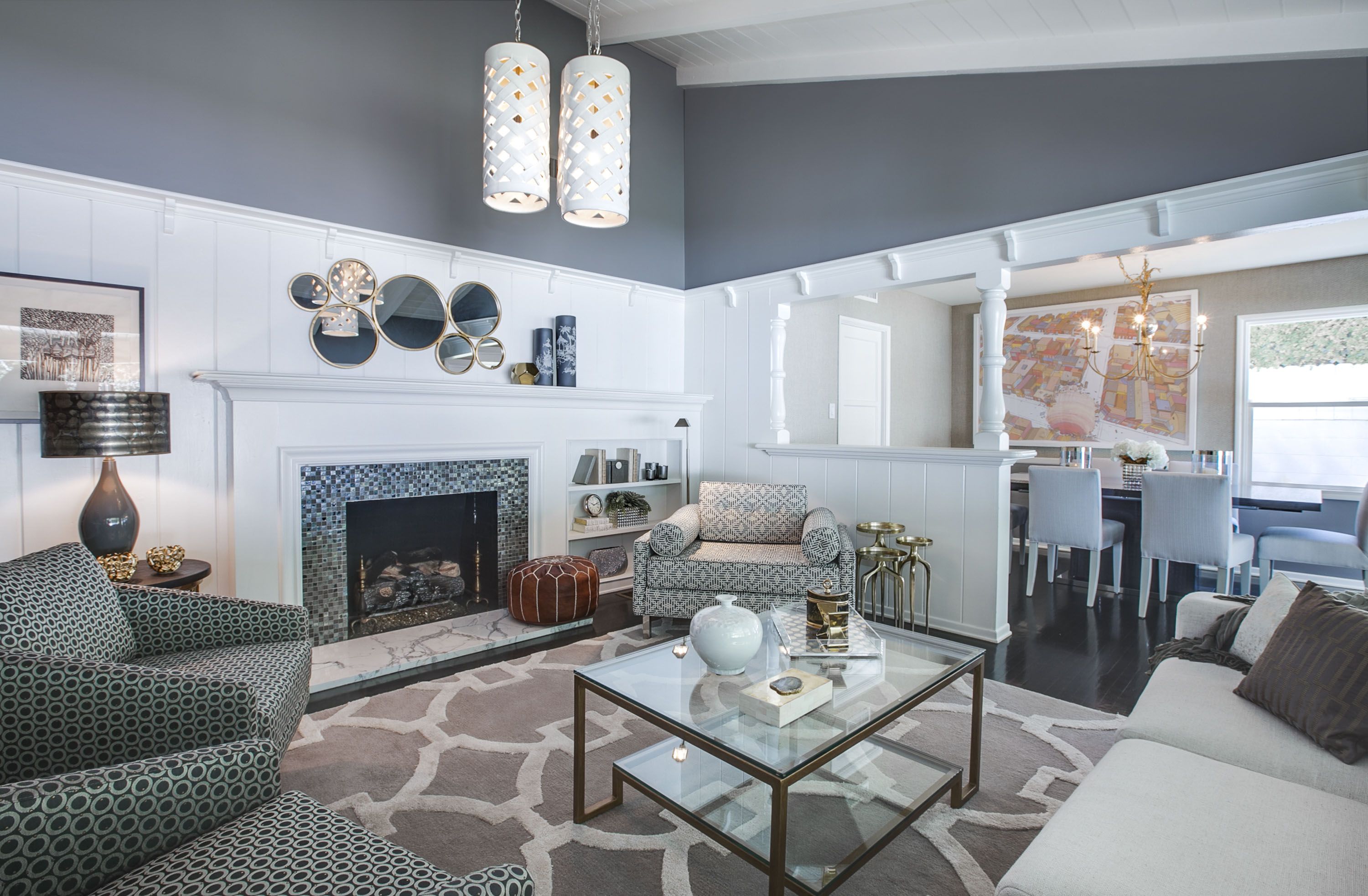
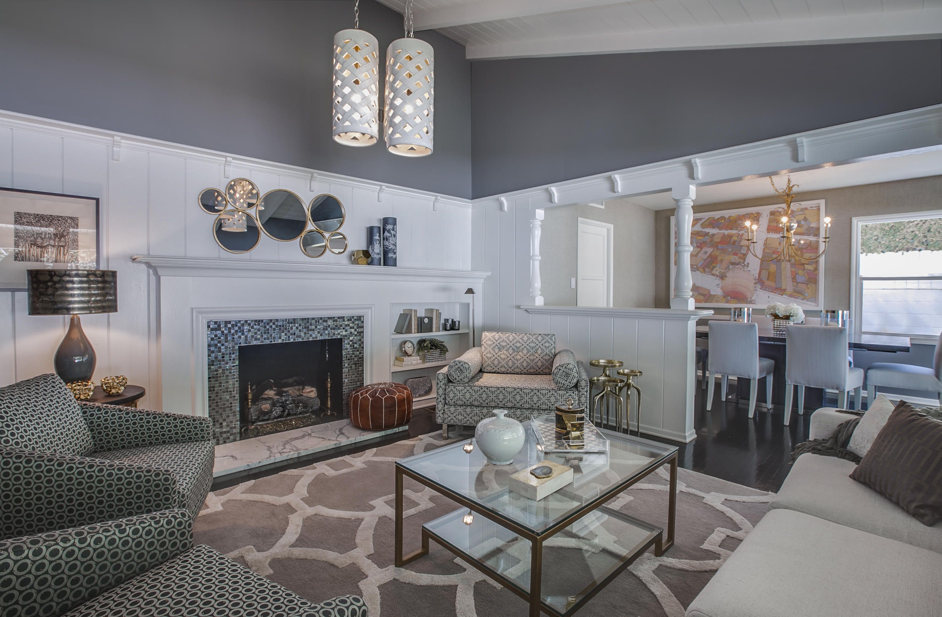
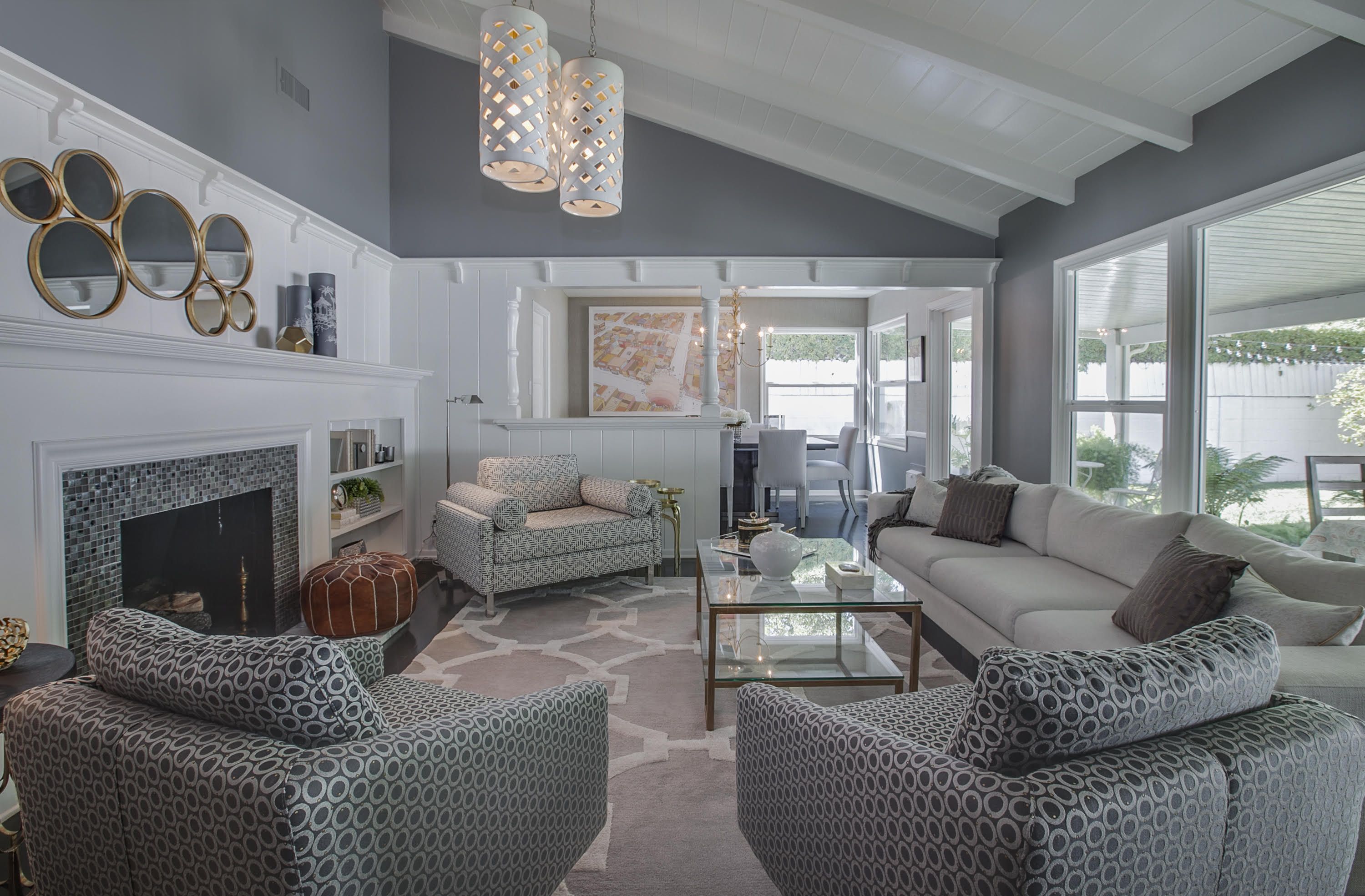
This is a project that I came into after the clients had already purchased most of their furniture, but they just could not make it all come together in a way that felt stylish and well designed. I came in and decided to paint the walls a medium grey. Many times, clients are afraid to paint in a medium or dark color thinking it will darken the room. However, in this case, there was no danger of that, since there was a large picture window covering one wall and a lot of white paneling on two other walls. What that did was create some drama by creating some contrast with all the white. Then I pulled it together by rearranging their furniture to take the best advantage of the furniture and the space. I also proposed a rug that pulled together the look with color and pattern and warmed up the space. The glass top coffee table helps to keep the room appear more open.
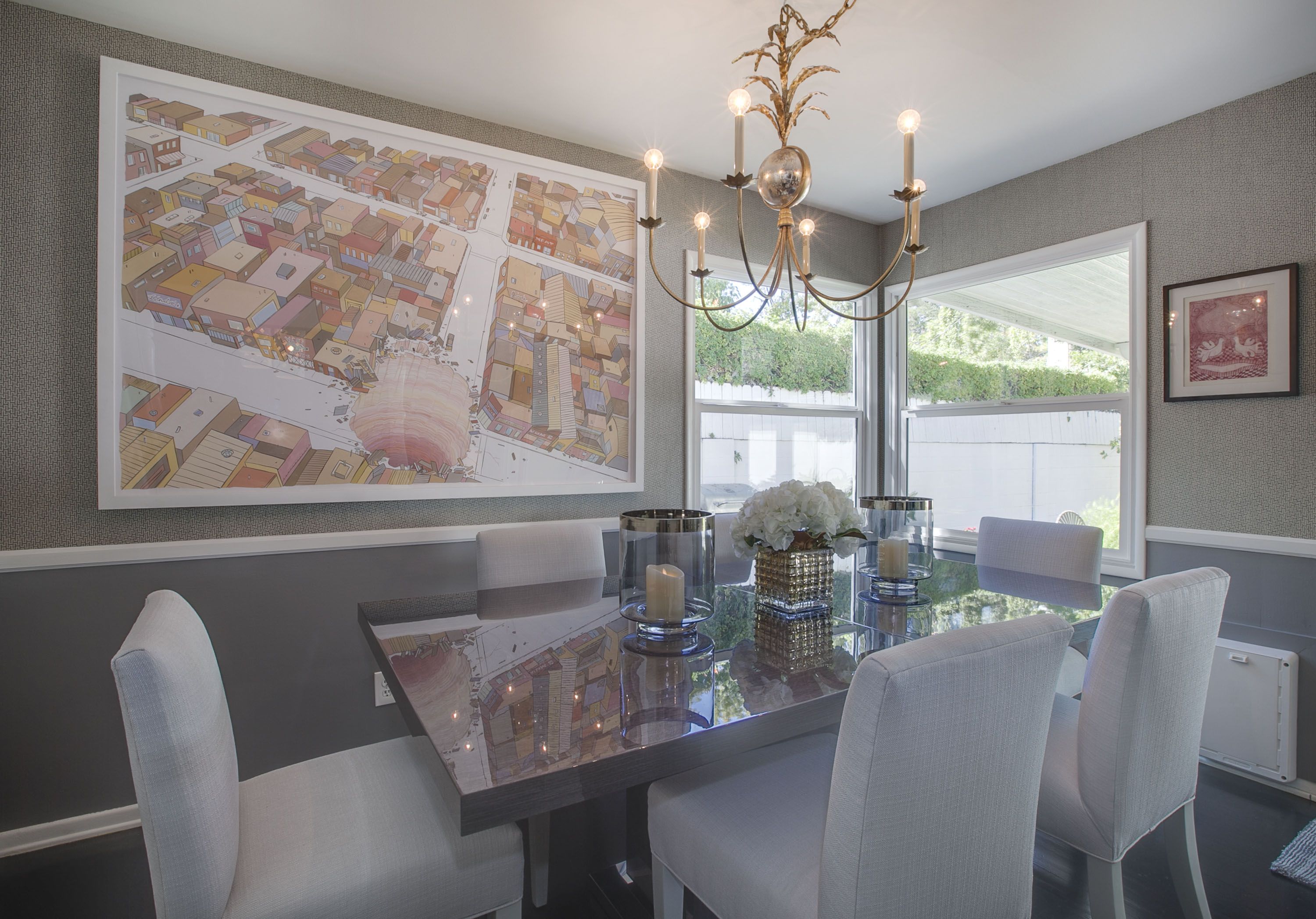
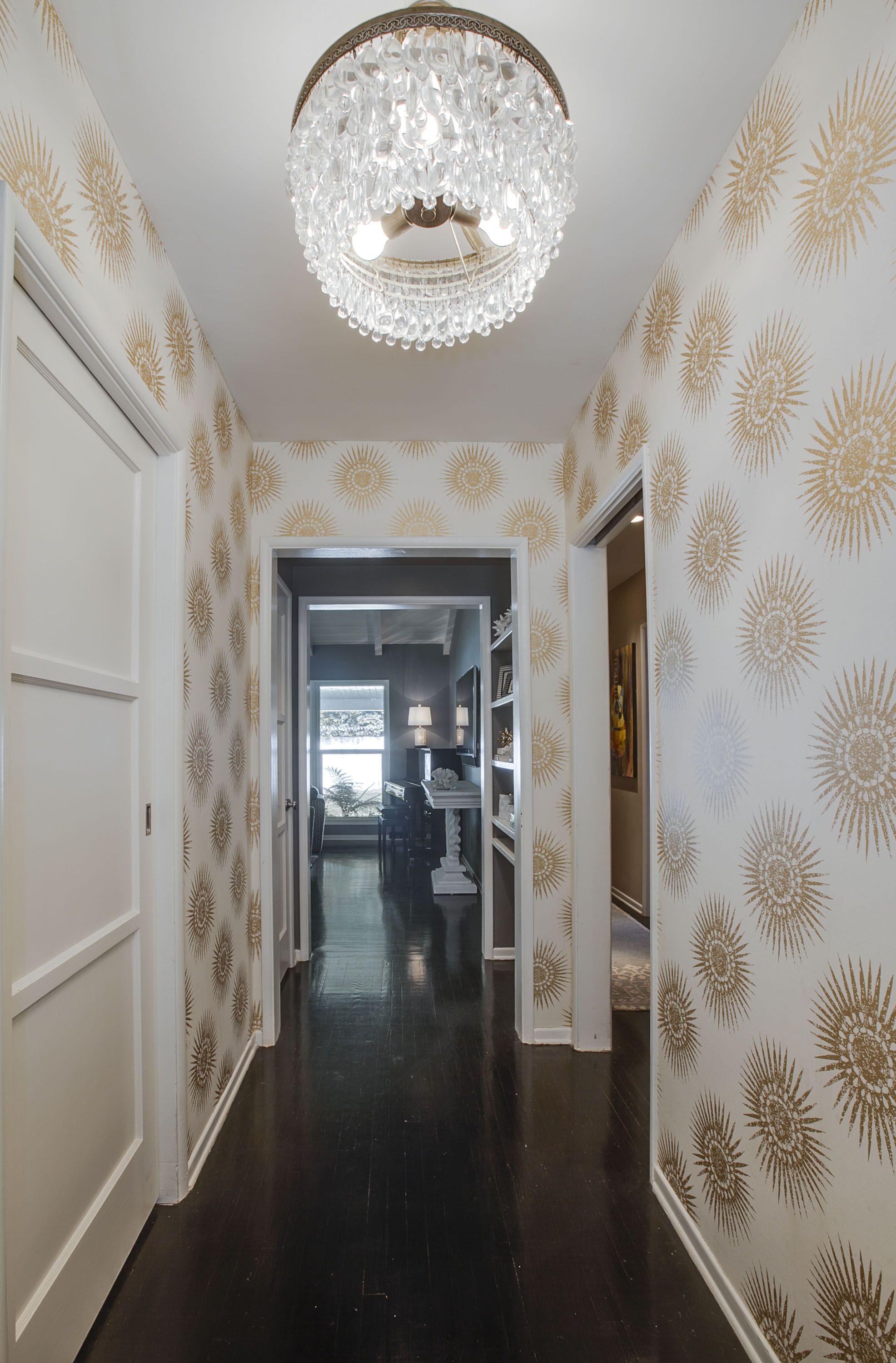
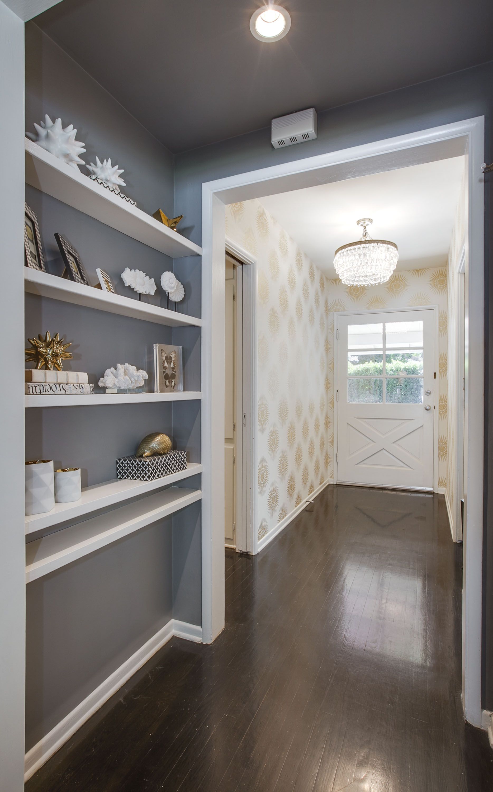
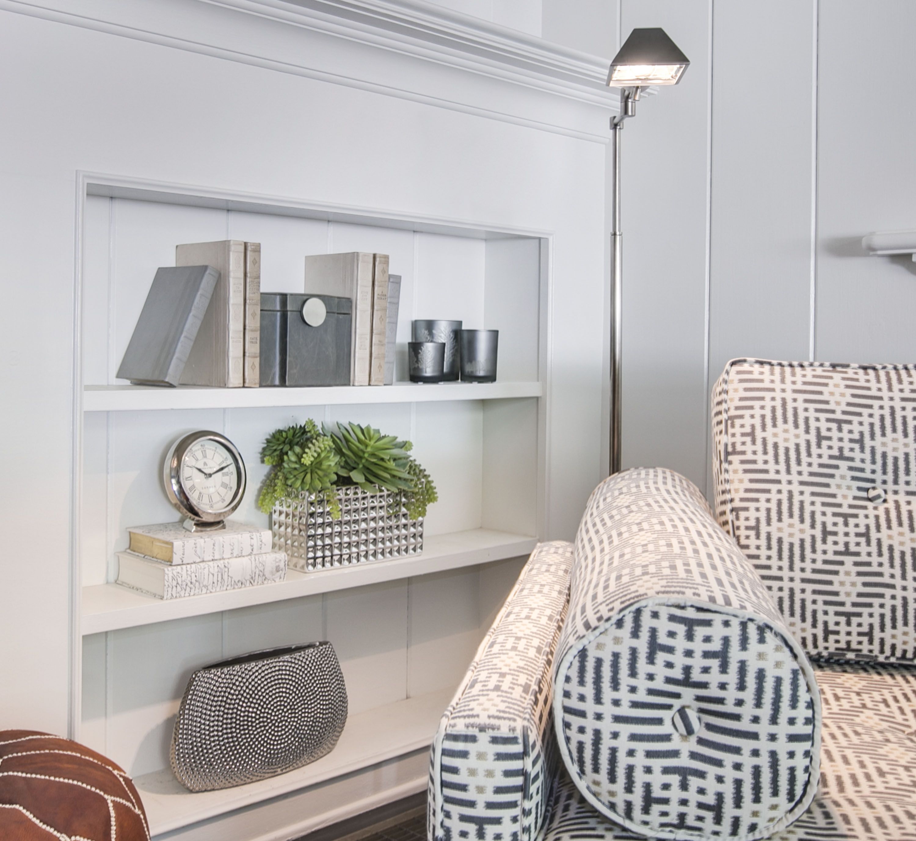
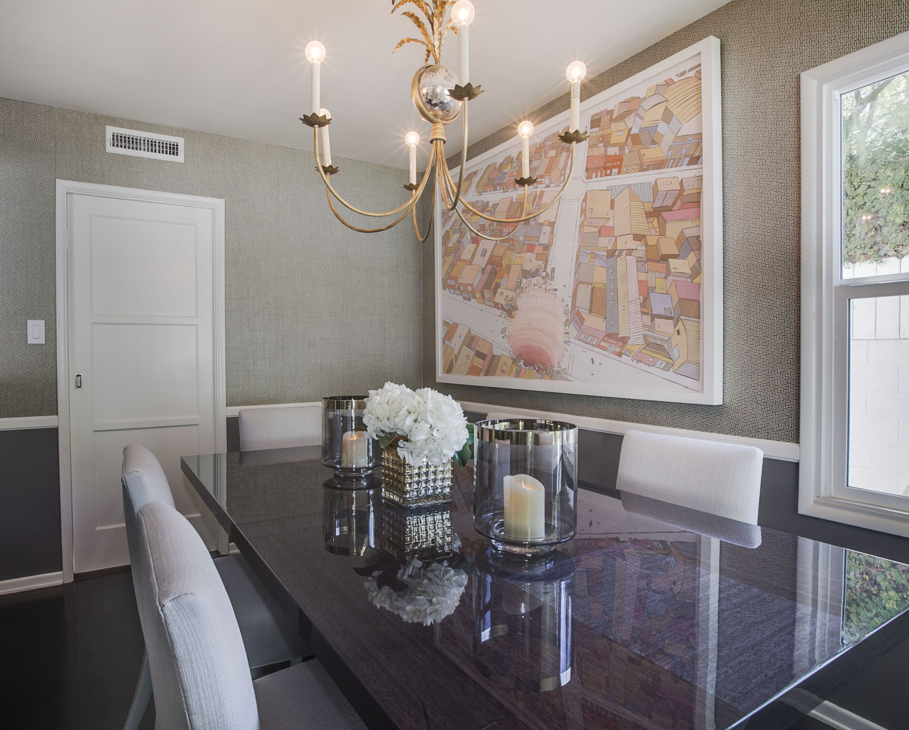
We decided on a sunburst pattern wallpaper for the entry. It is upbeat and welcoming, which is exactly what you want in an entry. Then in the vestibule between the entry and the living room we brought out the built in shelves by leaving them white and painting the walls and backs of the shelves in grey. Then we accessorized the shelves all in black and white, white and gold which set the scene for the color story of the living room just before you enter it. Anytime you have a chair rail or wainscoting in a room, especially a dining room where it is more common, it provides the opportunity to wallpaper the upper half and paint the lower half. It can keep the walls from looking too busy if the wallpaper is a busy pattern. It also makes it more interesting to combine the textures in the one room.
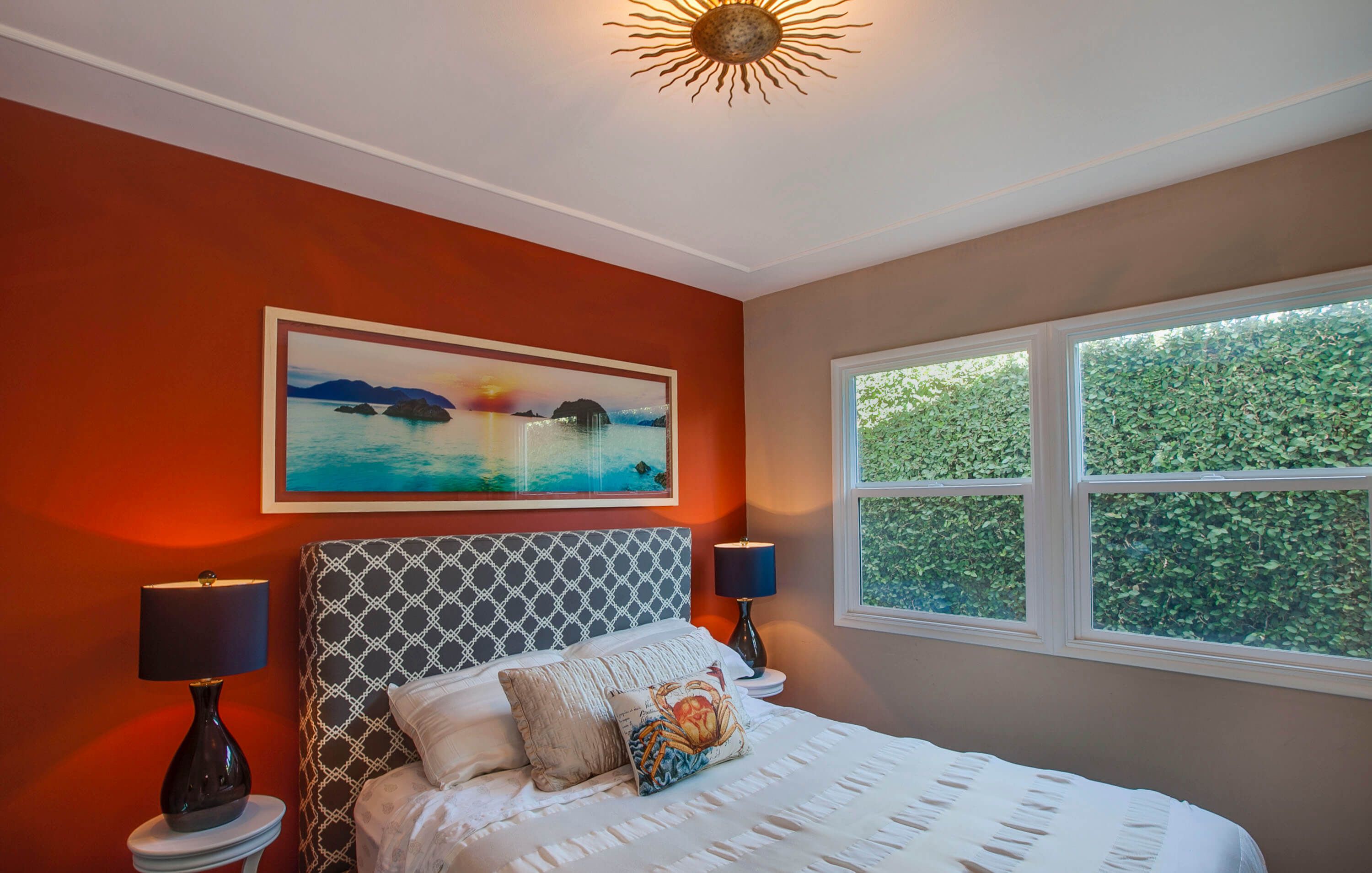
A great way to use strong colors is to paint only an accent wall. Colors that would be overpowering painted on all 4 walls of a room can create some excitement when painted only on an accent wall. That’s why we chose to paint the accent wall in the guest room in a burnt orange. It also works quite well as a backdrop for the dark grey lattice patterned headboard. The ceiling light fixture continues our sunburst theme that is also on the entry wallpaper. One of the elements that works for these clients is to carry the same neutral color story throughout the home.
To view slideshow, click and hover over image for arrows.

